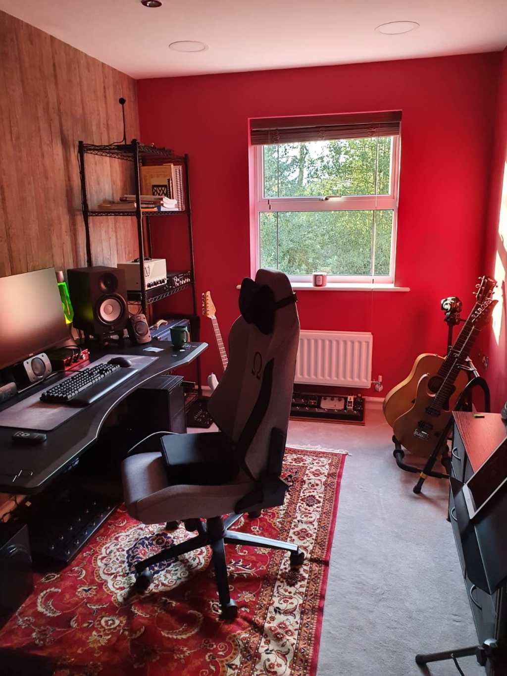
Danica’s Interiors: Part 2 – The Redrum (Music Studio)

Hello again ladies and gents!

I’m back with part 2 of my apartment renovation/redecoration.

I thought I would next show you all Sam’s studio room, AKA Studio Aloe (because of the only plant in there), aka the Redrum (because of the walls.)

20190927_211807

Here is Sam, my better half, looking very happy with our home purchase, having the second bedroom all to himself and this second hand rug his parents found at an auction.

Screen Shot 2020-04-01 at 22.26.29Image of Sam from his website.

Sam is a self employed freelance musician and guitar teacher. He teaches privately from home and then works with other musicians across the country as well as does filming and demos for different companies in his industry. So, it was important for us to have a 2 bedroom place so that the second room can become his studio room/gaming room/man cave. You can check out his youtube and demos on his website: stwmusic.co.uk

Inspiration images from Pinterest

Sam had a rough idea on what he wanted his studio room to look like. He wanted some form of feature wall that had a wood pattern to it and then some colour on the rest of the walls. Originally he wanted peach walls, but I wanted peach in the living room, so I got to looking at different colours to see which he would prefer.

In my previous post, I mentioned what colour we ended up choosing for the studio walls, but we started off with a few different colours and shades before settling on the perfect colour for his studio. Once we’d chosen a colour, we could then start looking at what to do with the feature wall.

We originally thought about using reclaimed wood which was in keeping with reusing materials throughout the apartment. We soon discarded that idea as we weren’t sure how sturdy or strong the wall between the studio and living room was and didn’t want to risk damaging our lovely new home straight away. So, we opted for looking at reclaimed wood effect wallpaper.

Above is the different wallpaper samples I ordered for Sam to have a look at. When we were looking at properties, Sam gave me full creative control, but I felt it important for him to have a say in what goes on in our new home, especially in his workspace. So with this in mind, I gave him a few wallpaper patterns to look at and choose from. Sam chose the Driftwood wallpaper by Galerie from Wallpaper Direct.

rooms_33639802_kings-apartmentsrooms_33655724_kings-apartmentsImages are my design using Roomstyler.

Sam is a bit of a perfectionist like myself, so I had a play around with layouts in RoomStyler to see which side the desk should sit on and show to him. It made more sense for the desk to be on the same wall as the feature wall. This way the wall will be in view for all of the filming Sam does for his demos.

Images are my design using Roomstyler.

I did try it with peach on the walls, but I still felt that it needed to be richer and darker.

20191018_120359

Once we’d chosen what was going on the walls, we then needed to choose what to put on the floors. Originally we thought about an engineered wood or some Karndean flooring, but as we’re in an apartment and wanted to soundproof the room, we felt that carpet would be the best thing. We chose our carpet from Tapi Carpets. Sam needed it to be easy to clean and hardwearing as it will get a lot of traffic from him teaching students and often some of these students are in their teens and have parents that sit in on the lesson. As the walls are quite dark, we wanted to make sure the floor was lighter so it didn’t distract from the walls and also didn’t make the room feel too much like a cave.

studio room product board

For the furniture, I left that to Sam to decide and he also double checked with me to make sure it all goes together. I created a visual board (pictured above) so we can see the colours and furniture ideas coming together. I always love doing boards like this to double check that everything will work together.

I’ve listed the products pictures above for you below:

Paint – Earthborn Lifestyle Paint in Can Can
Wallpaper – Driftwood Wallpaper by Galerie from Wallpaper Direct
Desk – Halberd Gaming Desks
Desk Chair – Secret Lab Gaming Chairs
Dining chair – Homesense
Shelving rack – Amazon
Drawer unit – Amazon
Prints – Displate 
Guitar stand – Hercules
Blinds – Adorable Shutters
Speakers – Yamaha HS Series and Logitech Z906 5.1 Surround Sound System
Monitor – Dell
Mouse – Logitech Pro Wireless Gaming Mouse
Keyboard – Logitech G513 Lightsync RGB Mechanical Gaming Keyboard
Guitars – Suhr and Taylor

We got to work straight away. Sam painted the ceiling in white, I sanded down the skirting boards and he sanded down the windowsill. Sam and his mom worked together to rip up the old carpet and got started on painting the walls.

20191111_095620

After the walls dried, Sam and I painted the skirting boards and windowsill with a fresh coat of white satinwood paint. We also cleaned, sanded down and painted the radiator to lighten it up a bit. A trick to getting the pant smooth on the windowsill is water the paint down a bit, paint a coat, then once dry you sand it down a bit, wipe clean and paint again. Do this a few times until you get a perfectly smooth finish.

Then once all the paint had dried, Sam’s mom and I started applying the wallpaper to the feature wall.

Video is my own. Music sourced through Bensound.

This wallpaper is paste the wall paper, so it made sticking it up much easier than if we had to paste the paper. I’ve never done wallpapering before, so I’m so glad that I have Sam’s mom who is the DIY queen to help us out.

After this we had the carpet delivered and fitted by Tapi Carpets. Sam also got an electrician to come round and install these large LED spotlights which he’ll use for when he is filming in the studio. Sam also decided to keep the normal LED spotlights that have a softer light for when he isn’t filming and just using the studio to do work and play games.

20191127_111024

Then we could move all of Sam’s furniture from the lounge (which at the time was our storage room) in to the studio room and Sam got to building it all.

The very last thing to go in to Sam’s studio was the blinds. We used a local, family company called Affordable Shutters. They’re a really nice company and although true to their name, their products are very good! They had so much to choose from and in the end we chose a set of blinds that matches the wallpaper perfectly!

IMG-20200226-WA0009
20191202_093308
20191202_093417
IMG-20191127-WA0000
IMG-20200116-WA0006
20191202_093400
IMG-20191214-WA0000All images are my own.

As he teaches privately in his studio, we needed to get a couple of chairs for his students to sit on, so we found these dining chairs from Homesense which matched his desk chair perfectly.

And there you have it! Sam’s home music/gaming studio is complete!

When I asked Sam what he thinks about his new studio room, he responded with “What?” and then told me to put that in my blog. Such love.
He then said “I love it. It’s my own personal, private space to contemplate the universe and separates my working life from our personal lives. Whereas before, I would do all my work in my room and you’d be there trying to sleep whilst I was working.”

What do you guys think? It’s quite a big change from how it looked before! Do you know of anyone that is in need of some design inspiration for their home music studio? Let me know in the comments!

I hope you’ve enjoyed this post and are keeping safe during this isolation!

Love,

Danica x

Danica’s Interiors: Part 1 – The Beginnings of My First Home!

Hello there my lovely readers!

It’s been a long time hasn’t it? I’ve been extremely busy with work and due to now being on lock down (thanks coronavirus), it seemed like the perfect time to settled down and start sharing with you all some rather big news and what I’ve been up to when I’m not at work designing kitchens.


If you follow me on instagram, then you probably already know that my partner and I after 11 and a half years took the plunge and bought our first home together!

We were so excited to start looking and thought it was going to be a lot of fun. Let me tell you, the search was NOT easy.

Screen Shot 2020-03-25 at 20.06.41.png(Image credit: Luff & Wilkin)

Long story short, the estate agent that was selling the property we ended up buying were useless and didn’t know how to do their job properly. We found this place which was a dream come true for us and made a conditional offer if we can get the lease to allow Sam to run his business from home. The agency didn’t even tell the seller that we were interested and told us it wold cost us £7,000 to get the lease change or even have an amendment attached. We ended up pursuing it through another agency, who told us the seller had no idea we were interested, and that the management company can just write a letter of consent, free of charge, to allow Sam to run his business from the premises. What!? However, because we saw our future home with the original agency, we had to unfortunately buy it through them, even though they BROKE THE LAW and didn’t inform the seller of our interest and offer. This was extremely frustrating as we could have moved in sooner if they did their job properly.

20191107_124401

Anyway, 8 months later (yes really) and we get our keys!

(Images above: Waterfords Camberley and Prospect Camberley)

Over the next few days I’ll be able to show you guys what I’ve been up to in our new home, including product boards and colour combinations. For now, I wanted to show you the before images of our apartment and the beginning stages of redecorating. All images of the apartment above and below are the estate agents photos. We got to see the apartment four times before we got our keys, twice whilst the previous tenants still lived there and then twice once they had moved out and with the apartment being completely empty.

(Images above: Waterfords Camberley and Prospect Camberley)

I moved in first to get started on the redecorating. Virtual tour of our new home before for you to see below:

We needed to get the bedroom liveable so I could start sleeping in our home and get the second bedroom turned in to a studio so that Sam can move in and start working from home straight away. This was the fun part that I had been waiting for. The decorating!

We first started off ripping up the old carpets in both bedrooms as they really needed to go.  Below is a small time-lapse of me being a strong independent feminine power house and ripping up the carpet! I love love LOVE DIY! Give me some wood and a saw, and I will get crafting!

After that I sanded down all the skirting boards and door frames in both rooms. I then wiped them down with a damp cloth and sanded them all over again to ensure I got a nice smooth finish. I did the same thing to the windowsills as well. When I’m redecorating, I like to make sure that I’m giving everything a bit of TLC.

20190928_224216.jpg

I was so excited to start unleashing myself on what was essentially a blank canvas! Goodbye ugly magnolia walls! HELLO COLOUR!!

Before I could pick the carpets for the bedrooms, I needed to think about what colour was going to be on the walls because that was going to influence what we then have on the floor.

20191008_162345.jpg

I am a nightmare for picking a colour because I am such a huge colour fanatic and I wanted the paint to be eco friendly with little to no VOCs. I wanted to be sure that my home will be in keeping with my values of living as responsibly and sustainably as possible.

So I ordered samples from the following companies:

  • Earthborn Paints – Made from clay and natural colours.
  • Farrow & Ball – Low to no VOCs and they are really high quality paints.
  • Little Greene – Also low on VOCs and a great selection of colours to choose from.
  • Lakeland Paints – Eco-friendly and no VOCs, as well as lots of colours to pick!

I had an idea on what colours I’d like to use where, but it’s hard to choose the one on a computer screen. So of course I ordered as many samples as I could!

20191008_182537.jpg

I painted each colour on to a piece of paper so that I could hold them up in the rooms I intended them for to see how they look in different lights. I pretty much had all the colours of the rainbow on my living room floor at one point! What do you think about these colours? I loved them all and found it very difficult to choose! But I managed to narrow it down to the following:

Living room – Shrimp Pink from Little Greene and Delilah from Earthborn Paint

can can.png

Sam’s studio/gaming room: – Can Can from Earthborn Paint

lily lily rose.png

Master Bedroom – Lily Lily Rose – Earthborn Paint


I even started collecting a few plants along the way… I couldn’t help myself. I have since bought 3 more plants for the apartment, but you’ll get to see them later on in the process. I have 12 plants in our apartment at present, and I have 6 plants still at Sam’s parents house waiting to come home… Don’t judge!

Unfortunately, that’s all I have from the very beginning stages. I’m really excited to show you what we’ve done with the apartment so far! Keep an eye out for more posts to come over on my blog. But, if you can’t wait that long, there are a few sneaky peeks on my instagram @danica_interiors where my all too impatient boyfriend has posted images.

The next post will be about his studio room as that is the only room in the apartment that is actually totally and completely finished.

Let me know what you think so far!

Please keep safe my lovelies! Stay home, stay inside and I’ll speak to you all soon!

Danica x


A colour lover’s kitchen: Why you should be brave to go bold with colour in your Kitchen!

I’m not entirely sure if you all know that I currently work for Wren Kitchens as a Kitchen Designer. This has been an amazing opportunity for me to design kitchens and utilities for people of all walks of life no matter what their budgets are.


Majority of the time, most of my customers go for more neutral or grey colours within their kitchens. This is due to the belief that if they go for a grey, white or beige kitchen design, it will make their home more attractive and easier to sell in the future.

However, there are many designers, as well as myself, who don’t believe that to be true.

Of course, with more neutral cabinetry, you can accessorise with lots of colourful objects, go for a bolder worktop, splash back or even paint the walls in a bright colour as a way of bringing in your own personality. But, they would always shy away from adding colour to their cabinetry for fear of falling out of love with the colour within a year of installation.

Every now and then however, I meet kindred spirits, colour lovers like myself who want to be brave with colour and really make a statement within their kitchen.

The kitchen is the heart of the home. It’s the space you probably use the most without even realising it. You make your 3 meals a day in there, as well as for trips to the fridge for a midnight snack. So, why wouldn’t you want it to reflect your personality and sense of style by experimenting with colour? It’s a huge investment, so why not go for something you know you are going to love?


Enter my customers: a lovely couple that live in Hampshire. Their original kitchen was white cabinetry with red and terracotta walls and lime green tiles. Just by looking at their original kitchen, I knew that they are colour lovers and wanted to freshen up the space, however I wasn’t entirely sure whether they were going to be brave with the door colours.


When talking to my customer’s about what they were looking for within their kitchen and creating a brief with them, they were leaning towards a pebble grey colour on all of the doors, with Quartz in “Highland White” and a Luxury Laminate in “Italian walnut” being used as the worktop surfaces, and they wanted a wow factor on their peninsular island with a feature colour. My customer had expressed that she loved the colours at Wren called “Midnight” Blue or “Bumblebee” Yellow to go on the island but she couldn’t choose between the two.

We spent about 2 to 3 hours creating the design together, coming up with a layout that works for their space and meets their needs. Quartz is a very expensive worktop material, so we agreed it would be best to save that for the island as it will also add to the wow factor and statement of the peninsular they were looking for, and have the luxury laminate on the rest of the run of units.

Screen Shot 2019-08-12 at 20.02.27Screen Shot 2019-08-12 at 20.03.40
(Not my own images. Images are illustrative and created with Wren Kitchen’s online kitchen planner to represent colour combinations.)

We played with trying one or the other colour on the island with pebble grey around the rest of the kitchen, but my customer just didn’t feel like it was giving them the dream kitchen feel.

AOTE4795
(Own design)

At this point, 2 and a half hours in, her husband had to excuse himself for a little break and a little walk around to get some more inspiration. Me and my customer were sat there having a chat, trying to figure out a way together to make these colours work. I had an idea and pitched to them to paint their walls a light grey instead, and have both the blue and the yellow used in their cabinetry. I suggested that they have midnight blue around the whole of the kitchen with the Italian walnut laminate worktop, and the bumblebee yellow on the island with highland white quartz worktop. Although my customers were colour lovers, I think they weren’t entirely sure whether this would work.

RYAC3095(Own design)

That was until I showed her how it looked in 3D and in virtual reality. She loved this idea! We waited for her husband to return, and we discussed what we had discovered. Funnily enough, he had the same idea whilst he was away from my desk, except with yellow around the whole of the kitchen and blue on the island.

Screen Shot 2019-08-12 at 20.04.30
(Not my own image. The image above is illustrative and created with Wren Kitchen’s online kitchen planner to represent colour combinations.)

We tried his idea out. I thought it looked awesome, but he did not seem to keen on having yellow everywhere. So I showed him my idea, and he also loved the colour combination with blue on all the units and yellow on the island.

QAQA8598
(Own design)

However, it was when they saw the design in virtual reality that they absolutely and completely fell in love with the layout and the colours used within their space. They could really see themselves working within and living with this kitchen, and the island gave them that really unique feature they were looking for within the space.

mace materials board
(Own image: Colour palette and product board created in Photoshop)

Fast forward a few months and I went round for a visit to see the end result. I thought I loved it when I designed it for them, and I fell in love with it when I finally saw it in person:

mace visual 01
(Own Photography)

The view from their dining room is absolutely breathtaking. They made the wall with a view in to the kitchen a feature wall by painting it in the same colour as their peninsular, which really ties the two rooms together and has such an amazing visual impact!

mace visual 02mace visual 03(Own Photography)

Not to mention the ingenious use of the bright pink on the archway and back wall, adding in another colour to the mix. This colour really highlights the architecture of the space along the archway and carries your eye around the room.


mace visual 11
(Own Photography)

When I expressed my love for using such a vivid colour, my customer’s said that they were going to paint all of the walls a light grey, but that I inspired them to be even bolder with their choices. We had joked in the appointments about having a pink kitchen and when I created the visuals for them I had styled them with bright pink placemats as a nod to our conversation and little inside joke. They loved it so much that they decided to paint the walls in the same colour and it works perfectly with their design!

mace visual 06
(Own Photography)

I also love that they didn’t stop there with their colour choices. They bought their own splash back that has a picture of a bright green lime on it which adds another pop of element to their colour palette.

mace visual 04mace visual 07
(Own Photography)

They also incorporated the lime green colour within their blinds, which you can’t really see due to the sunlight coming in through their window, but you can see the light reflecting the colour on to the ceiling. This also tied in perfectly with their parasol outside in the garden. I love that it is also a little homage to the lime green tiles they had in their previous kitchen.

mace visual 05mace visual 08
(Own Photography)

The sink they chose is a black glass top sink with stainless steel bowls, which matched perfectly with the appliances they chose. As their island isn’t exactly a traditional island and more of a peninsular (meaning it comes off a run of units from a wall in to the middle of a space), they didn’t want one colour cabinetry to intrude too much on the other. So we designed the peninsular and the corner where the colours meet to be mitred so that they got a clear line going down the centre between the two.

mace visual 09mace visual 10
(Own Photography)

To add to the uniformity of the kitchen, we made sure that the worktops were the same thickness and the upstands for each material were the same height, so that it was one continuous line along the back of the worktops along the walls. As the feature unit on the end of the island has a frontal on both sides, I advised that they place false doors underneath the breakfast bar to tie it all in together. The customer chose to go for open shelved feature units in the same colour as the laminate worktop to carry it throughout the space. The use of the dark wood effect worktop, the dark grey flooring and the light grey walls work really harmonise with the brighter colours and help ground them.


When I asked my customers if they are happy with the end result, they replied,

Absolutely! Every morning when we come downstairs, the kitchen really brightens our days and it’s so inviting. We wanted to be more brave with the colour and we’re happy we chose went for brighter colours in the space. Whenever we have visitors round, they always compliment the design and say how well all the elements work together. We are really pleased and were lucky to have you as our designer.

I (obviously, because I am a colour lover and am biased) honestly loved the end result! I think even though it’s a country styled door, it is still quite a modern kitchen, with a fantastic mixture of traditional and contemporary. It makes me happy when my customers want to express themselves within the design and, trust my vision and ideas. If they are happy, then I am happy!


I feel it’s so important to experiment with colour in the home and that it doesn’t have to stop at just being in the living room or bedroom, that you should experiment with colour in the kitchen, too. This doesn’t mean that you have to buy a whole brand new kitchen. You can easily update the space just by painting the doors or buying replacement doors if you know where your current kitchen originally came from. Colours in the home can really lift our spirits and affect our moods, and that is no different in your kitchen!


However, if you are looking at buying a whole new kitchen and changing the space, why not go bold with your colour choices? It’s a complete myth that going for plainer, simpler colours will affect the resale value. Chances are, if it comes to you selling your home and you’ve fitted a white or grey kitchen, the person buying that house will most likely rip it out anyway. A Kitchen is a HUGE investment, so why not choose a colour that you love? Even if you are living there only for 3 or 4 years and plan to sell, you will always feel better about going for what you want and spending your time in a space you love, than going for something safe and wishing you had invested a bit more in your kitchen.


It’s easy to be bold, you just have to take that leap of faith with a colour you truly love! Why not try creating a design with your favourite colour? Or secondary favourite? This can be on the doors and drawer frontals, the walls, the worktops, the splash backs, the ceiling, you name it! Trust me, once you’ve added some colour, love and care to your kitchen, you will love it so much and not want to go back!

Additionally, if you are in to monochrome, then that’s absolutely fine, too! You do you, do what makes you happy and not what you think society and everyone else will want. If you love dark cabinets with white worktops, and lots of contrast, go for it! High contrasting kitchens are sexy and sleek no matter what the style is!


What do you think of this kitchen design? Has it inspired you to go big and bold? Or do you prefer more calmer colours? Or are you in to monochrome colour schemes? Let me know in the comments below!


Danica x

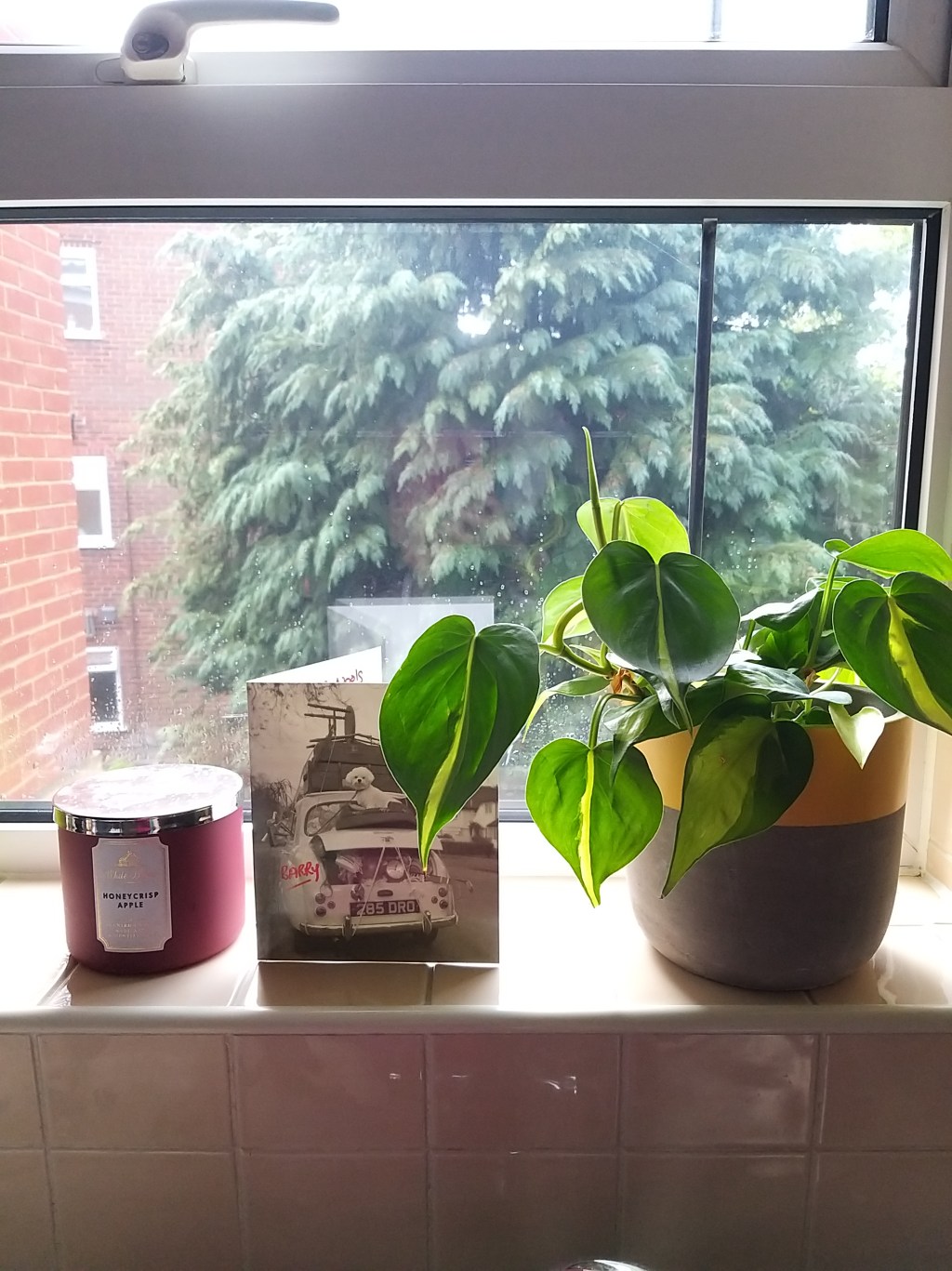
Concrete Planters: The must have item for your plant babies this Spring/Summer 2019

Hello friends! I know what you might bet thinking, concrete planters aren’t a new concept or a brand new invention. Planting, whether it’s indoors or outdoors, is back in fashion in a big way with the rise of conscious and mindful consumerism. More and more people are looking to have plants in their homes because of their health and well-being benefits. As proven with Biophilic design, just having plants in your home can help improve the indoor air quality in your home and also improve your mood and mentality.

This is one of the many reasons why concrete planters have become the must have interior accessory to coven. No two planters are the same, even when created with the same mould. There are so many different colours, shapes, patterns, sizes and textures available when it comes to concrete planters, so I am not surprised that they have become to popular!

Below I have listed some of my favourite designer makers that create their own concrete planters with a twist. Once you see what they have lovingly crafted, you will be sure to want some of their concrete planters in your own home!


Molley Designs

Emma Molley is a designer-maker and concrete wizard. Her concrete accessories are so incredibly unique! Molley is experimental with her creations with shape, texture, colours and patterns which really sets her products apart from the mass produced homeware accessories you see online or on the high-street.

Succulent plant pots:

(Image credit: Molley Designs, Etsy)

These succulent planters are perfect for this who are not green thumbs and want real life plants but without the hassle of having to water them every day. How gorgeous does the organic, rough texture on the concrete look against the vibrant green leaves of the succulent plants? A great meeting of industrial style and nature.

Macrame concrete sphere plant holders:

(Image credit: Molley Designs, Etsy)

A clever twist (pardon the pun) on her spherical concrete tea light holders, changing them and adapting them into hanging macrame planters! I love the contract between he rough exterior and jagged edges of the concrete against the soft, colourful thread of the macrame. This would make a great focal point in a corner of your room above your reading nook, above your bed as a canopy, in your office space above the desk or displayed proudly for all to see in your window. Each individual macrame piece Molley has created is unique and these would look fantastic in a bohemian interior scheme as well!

The Summer Collection:

(Image credits: Molley Designs, Etsy)

These are probably my favourites from Molley Designs of all time! Colourful marbled effect concrete planters! It’s such a fun and vibrant take on the usually grey concrete plant pots. How gorgeous do these look? These are perfect for colour lovers that are looking to add something truly special to their home. What’s even more fantastic, is that all of Molley’s creations are multi-functional. If you feel these are too pretty to be used for plant-life, you could use them as candle holders or a jewellery dishes instead!

To check out more of what Molley Designs has to offer, just take a look at their Easy page here.


Concrete Candy

I have been a big fan of Concrete Candy’s products for a while now. Sarah, the founder of Concrete Candy, has a genius way of playing with colours and combining different materials to create truly one of a kind pieces.

(Image credits: Concrete Candy)

I love the contrast and also harmony of the concrete base and the colour tops. No two plant pots are the same, with the tops being made up of different materials such as resins or jesmonite. They come in many different colours, finishes and sizes, with some of the tops having an almost terrazzo effect to them. These planters go with any interior scheme and are one of the most instagram-able and stylish concrete products I have seen.

(Images Credits: Concrete Candy)

Concrete Candy also don’t do just plant pots. They have an array of different products available from coasters, wall clocks and incense holders to lollipop and pudding inspired sculptures, Candy Concrete’s accessories are works of art.

If you want to see what else Concrete Candy have available, simply just check out their website here.


Fruit Salad Studio

Fruit Salad Studio is an independent homewares and decor shop based in Brighton. They make some wonderful little plant pots that are perfect for your succulents and other plant children!

(Images Credits: Fruit Salad Studio, Etsy)

What I love about these plant pots is how organic the colours and textures look within the marble effect pattern of the concrete. All the colours work well together, especially the terracotta orange where it looks like rusty copper, which really adds to and fits in with the industrial, rustic feel of the plant pots. The dark grey and white pots look stunning when paired with a pink backdrop and would work well in both masculine and feminine schemes. These would make the perfect gift for loved ones or be the perfect accessory for your windowsill or desk, be it at work or at home!

You can see all of the different planters Fruit Salad Studio has for sale here.


Green Living Glasgow

I pretty much squealed with excitement when I saw these planters! How adorable are these Bulbasaur and Oddish concrete plant pots!?

(Images Credits: Green Living Glasgow, Etsy)

These pokemon planters are perfect for a little planting starter pot for little ones (or pokemon loving adults as well). Children now days are always watching tv at home or on their own iPads or gaming with friends online, and with consumers and younger generations becoming more environmentally conscious and aware, what better way to start teaching little ones on how to look after plants and to take care of plants (and also the planet) than these Grass Pokemon inspired plant pots? Any kid (cough-adult-cough) would love to have one of these in their room! I mean… I really want one for myself! Now if only someone could create a Gloom themed planter or even Ivysaur or Venusaur.

Not only do they sell plant pots, but you can also purchase little plant friends to go with them from their online store!

You can see their range of plants and planters here.


Crafty Little Cactus

If you are really a bit more worried about the carbon footprint in regards to delivering your concrete planter, then there is a designer-marker in London that creates Bulbasaur and Oddish planters.

(Images Credits: Crafty Little Cactus, Etsy)

Crafty Little Cactus have a variety of different concrete plant pots that are the perfect homeware accessory for a geeky friend or to fill your geeky needs! Not only do they have pokemon planters, but they also make concrete planters inspired by other franchises such as Star Wars and Guardians of the Galaxy.

(Images Credits: Crafty Little Cactus, Etsy)

How cool are these Star Wars themed planters and this Groot plant pot? These would be the perfect gift! Only difference I can see between the two Bulbasaurs is that Crafty Little Cactus looks to be a bit smaller in size, however you can still use it as a starter pot. How adorable would a larger succulent look on tieback of this little Bulba? Definitely thinking of getting one for myself!

(Images Credits: Crafty Little Cactus, Etsy)

Crafty Little Cactus also have different shapes and sizes of planters available for those that aren’t that in to comic books and sci-fi! Look at these adorable little geometric planters. These look ultra-modern and sleek, and I love that you can either have them sat on their own or stack them up to create your own work of living plant art! All of these items would make beautiful gifts, even the more tongue in cheek ones. Another pot that I would have to buy! It’s just too good to pass up. I can also see a few that I may have to buy my partner as well.

You can check out all of Crafty Little Cactus’ glorious geeky accessories here.


Maison Des Pauvres

Maison Des Pauvres is a Hampshire based company owns by two sisters that have a love and fascination with concrete. Their ethos is to find the beauty within the imperfections of the material and celebrate it and they are inspired by the Japanese view of Wabi Sabi. Each product is hand mixed, hand proud, painted and sealed to ensure that you get the highest quality product.

(Image credit: Maison Des Pauvres, Etsy)

Their products certainly are unique and beautiful with it’s imperfections. I love the contrast between the rough gold paint and the dyed concrete, where you can see the porous exterior showing through in the cracks of the paint. I also love that their concrete planters are solid with their colours, which sets them apart from other designers. I can really see these being styled within a gorgeous kitchen that has brass or gold accessories on the handles and lights, or on a coffee table amongst some gilded coasters or candle holders (which these talented ladies also sell in their shop). I’m especially obsessed with the concrete gold moon wall hanging plaque. May need to get my hands on one of those!

You can see the whole range from Maison Des Paupers on their etsy shop here.


DIY Concrete Planters

Want to try your hand at making your own concrete planters? It’s super easy to do and inexpensive to make. Below is how I made my own concrete planters when I was studying at Uni a few years ago:

Screen Shot 2019-04-23 at 19.47.08

(Images Credit: My Own)

All you need is:

  • Concrete mix, which you can buy from any DIY shop
  • An old juice carton or ice cream tub
  • Scissors
  • A stirring stick
  • Water
  • A cup (preferably paper) as the hole in the plant pot (I used styrofoam cups back then, which I now know is a big no no, so please do use recyclable paper cups or a solid cup that you don’t mind reusing for concrete planter moulding)
  • A scalpel


Screen Shot 2019-04-23 at 19.48.03

(Images Credit: My Own)

Cut the carton in half or to which ever desired height you’d like your concrete planter to be. Really have a look at the carton and where about you want your plant to pop out from.

(Images Credit: My Own)

Once you have done that, mix up your concrete with water. What I did was I just kept adding a little bit of the dry mixture and water together until I was happy with the quantity and consistency. When you’ve reached a stage that you’re happy with how the concrete mixture is looking, tap the carton or tub on the table top or on the sides to let out any air bubbles that may have gotten trapped when you were mixing it all together. Then place the cup in to the centre and press down. Secure the cup with masking tape (again, silly young naive me used sellotape, which did the trick but is not very environmentally friendly) and let it dry for 24 hours. Once that is dry, you can cut away the card or tub using a scalpel.

img_09852x

(Images Credit: My Own)

And ta-dah! You have your very own concrete planter! I love how mine turned out and I still use them today! I love how you never know how they are going to turn out and every plant pot is unique. For example, I used an left over plastic soup pot for the rounded one that came out really smooth and sleek, yet the orange juice carton’s exterior texture is all rough, rustic and organic.


I have a feeling that I may end up accumulating quite a few new concrete planters by the end of the month! What do you think? Are you loving the concrete planter trend? Would you want to try and make your own? Let me know what your thoughts are in the comments below!

I hope you all had a wonderful Easter weekend!

Danica x

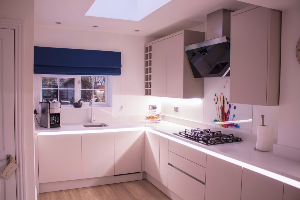
Visiting my first Kitchen I designed

Hello there!

So, I’m not sure if everyone knows this, but I’ve been working for Wren Kitchens for about 6 months now as a kitchen designer! It has been amazing and I’ve loved every minute of it so far!


I’ve met so many different people who I have designed for, however these things do take a bit of time and it’s only now that their dream kitchens are becoming a reality!


A couple of weeks ago I got a call from my first ever customers that I sold to earlier this year asking if I’d like to come over for a coffee to see my first kitchen design as they knew I wanted some pictures for my portfolio. It was so lovely to hear from them, so we set up a date and time for when I was off and they were free and I went round to have a look and a catch up with them.

13802-1Screen Shot 2018-06-21 at 10.50.56

(Image: CAD visualisation of their kitchen design)

Well, even I am impressed with the outcome! The showroom I work in is so inspiring and full of incredible displays and design ideas, but it’s not until you see the product in a real home that you fully understand how amazing it is!

The brief for this kitchen was to create a modern space. My client wanted their dream kitchen to be streamlined, clear, uniformed and sleek, yet also warm and welcoming. My client loves to bake and wanted an area in the kitchen where they can prepare the dough, with easy access to the ovens. My client has a lot of members in their family and they wanted an area where they could entertain but also somewhere they could sit with their grandchildren when they come to visit. Both aesthetics and functionality was important to them, and they needed plenty of surface area and storage space. Their kitchen before was in need of an update and did not have as much storage or worktop space that they required.


composition 54 (1)composition 55composition 58 (1)

(The complete installed kitchen reveal! My own images.)

The space they had to use was quite large. The seating area was originally the garage, which they ended up converting to be part of their kitchen space, giving them more room in the home to have guests over for dinners.

When designing their kitchen with them, my clients felt that a handless style would give them the sleek contemporary look they wanted to achieve. After going through the different handless options Wren has to offer, we came to a conclusion that the Milano style in the Infinity Plus range was the right option for them. This style of handless doors is better for them for functionality and accessibility because of the profile that runs along the top of the door frontals and vertically down the tower units, giving their fingers a comfortable grip when opening the doors and drawers. The carcasses for this style of kitchen are made by Wren and the profile cuts in to the carcass, meaning that the doors are squared and it also means that the cabinets are truly handless.

composition 56 (1)composition 60 (1)

(One end of the kitchen. My own image.)

This also meant that we could create a great atmospheric vibe with LED lighting along the profile under the worktop and match that lighting underneath their wall units. These LED strip lights are not only fantastic for energy rating, but they also really pull this look together. My clients loved this as when it’s late at night, they don’t need to turn all the lights on to see where they need to go. They did joke that they’ve had comments from their family and friends that the lights make their kitchen look like “Starship Enterprise”. Something that I’ll take as a compliment as I love Star Trek, so the geek in me was giving herself a high five!

composition 57 (1)composition 59 (1)

(Bank of tower units! My own images.)

How incredible does this bank of tower units look!? Originally there was a door along this wall that goes in to the living room, however my clients wanted to utilise the space to fit in the ovens, microwave and fridge freezer. We felt that it would be best to have their cooking appliances at eye-level, with the single ovens being placed on either side of the oven to achieve symmetry. Then we finished off the row of towers with a 70/30 integrated fridge freezer. This helps carry the eye around the room, as all the lines match up under the appliances and the lines are at the same height as the worktop.

composition 60 (1)

(Cooking area. My own image.)

At the top end of the kitchen is where majority of their utility services are, which is where the majority of activity would be happening in the space. There was a lot that had to be fitted in to that part of the kitchen, which includes the sink, a dishwasher, their washing machine, a gas hob, extractor, as well as storage space and a drawer stack for their cutlery. This also needed to be within the rule son the working triangle, to ensure that my customers didn’t have to walk very far to get what they needed in order to complete any tasks they are doing in the space. The glass splash back is their own addition and they sourced it from Fleet Glass. I love it and think it adds in just the right amount of colour to the space and really lets their personality shine through!

IMG_0104 (1)

(Island units. My own image.)

This is where the island units come in. You may be thinking it’s a tiny island, however in my customer’s old kitchen, they had an island just like this, at the same depth and width. The island is there to serve as a place for my customer to do their baking, where they can then turn around and place things straight in to the oven. When I visited them, they said they don’t use the island surface area for baking now, and actually use that as a place to serve up their meals or when they have visitors they set food out. They said that they now use the peninsular island as their prep area for any baking activity!


I’m so pleased with how this design turned out and I was really proud of it! My customers were really pleased with the end result as well!


What do you think? Would you go for a modern kitchen design? Or would you go more traditional like a shaker or country style? Let me know in the comments below!


Danica x

4 shops in Brighton to help you on your way to a Zero Waste lifestyle

Zero Waste. 


It’s a term that is being used a lot lately, even I have used it in the past, like when I wrote about the best Zero Waste places to shop online here and about buying sustainable Christmas presents here.

It’s all well and good that there is access to places online, and it is certainly easier in this day and age to buy items and products online. However, if we think about how those items are delivered to us, it still involves shipping from abroad or driving across country, which in turn uses up precious resources. We either rely on convenience when it comes to buying anything for our homes, be it food, personal hygiene or cleaning products that we don’t even think about what it is that is wrapped around these items. The packaging for these items are often at times non recyclable, and end up in landfill or in the oceans, ultimately ending up in our food chain. Animals are being poisoned and dying because of plastic pollution, and it’s thanks to programmes like Blue Planet and Drowning in Plastic that are bringing light and spreading the word on the war against plastic. It’s finally starting to open peoples eyes, though there are still quite a few who unfortunately  prefer the convenience of wrapped goods and who, quite frankly, just don’t give a damn about the environment. Which, is just sad and heart breaking. It’s also down to education, not knowing where to go to start living a more eco-conscious life that is preventing consumers from making ethical decisions on what they are buying and how they affect the environment.

It is due to this demand in the market that there are now more options out there to help you on your way to making better decisions. Slowly but surely, some supermarkets are making changes to ensure that they are selling more ethical products to benefit not just their customer but also the environment. However, that is few and far between, as it’s something that will take a long time. In the meantime, there are some actual packaging free shops that are around and have been established for a few years now.

These shops are known as whole food stores or Zero Waste shops. These establishments are basically Greengrocers, like how we used to have years ago before the throw away culture came in to being. Zero Waste and whole food shops specialise in packaging free items and organic foods, things that have not been treated or near harmful chemicals and toxins, and are more better for our health. They also aim to prevent more plastic ending up in landfill and in our oceans, harming wildlife and releasing toxins in to the food system.

So, why Brighton? Well, I was going to visit a friend from University, who recently moved to Brighton. I love Brighton! I love how forward thinking the city is, how they celebrate all walks of life and all the interesting little independent shops they have. It’s because of this that I was interested in seeing if they had any local Zero Waste shops. The night before I drove down, I had a little look online to see if they did have nay shops, and I was pleasantly surprised! When I got to my friend’s, I mentioned these stores to them, as one was literally just down her road. Thankfully, she is like me and wants to make better decisions and help save the planet with her choices, so she also wanted to check these places out with me!

I also wanted to explore these places, incase some of you guys and girls did not know about them and may want to check them out when you next visit Brighton, or were also thinking of relocating to the city and needed to know where you can go for your fresh and packaging free shopping needs!

Infinity Foods

hcmp628_330120
(Image credit: Happy Cow)

This shop is one of my absolute favourites! I’ve visited it before and I could spend an hour browsing the shelves, perusing the isles of products they provide and blow my entire month salary on bits and bobs… Or food.

(My own images)

It made me giddy to see they have a whole selection of packaging free and eco-friendly items for sale that were made from natural ingredients, eco-conscious, cruelty free and vegetarian or vegan. I got lost in the sniffing of shampoo bars, toothbrush powders (yes, it is a real thing!) and squealing over refillable household cleaning solutions. And, of course, scanning the food shelves for anything tasty. I think my friend might have thought I has lost my mind. It’s just that, sadly, we don’t have this in my local town or local Sainsbury’s.

IMG_0387

(My own image)

Now, Infinity Foods are far from perfect, as there are some things that were for sale that were not recyclable due to what the packaging was made from, for example crisp packets, plastic tubs and wrapped foods. But, even though this is the case, they are doing a lot more than most of our local and major supermarkets are in the war against plastic. You can find out more about Infinity Foods here.

Down To Earth

IMG_0446

(My own image)

The next day we visited the other 3 zero waste shops. We took a walk down the road from her flat towards a shop called Down to Earth. Down to Earth is a tiny little store that is completely vegetarian. It stocks loose vegetables from local farms, has refillable jars of pulps and grains as well as household cleaning products.

IMG_0443

(My own image)

The majority of it’s bath, body and cosmetics items were also cruelty free, however they weren’t as packaging free as I thought it would be. Again, this isn’t that bad, they are actively trying to be, which is more than can be said for supermarket chains! I really liked Down to Earth, it was tiny bit mighty and has a great message! I love that they have reusable metal water bottles from companies that donate some of it’s profits to helping clean up the oceans. You can find out more about Down to Earth on their websites here.

IMG_0492

(My own image)

My friend and I ventured in to Brighton centre again but closer to the train station towards Brighton Open Market. It was in here that we came across some cute little stores, cafe’s and restaurants.

Wastenot

(My own images)

It is in the Open Market where the next Zero Waste shop is located. This shop is called Wastenot. Wastenot has only eco-friendly, recyclable packaging or items that come with no packaging at all. I also love the bare, stripped back, exposed wood look they’ve gone for inside the shop.

(My own images)

One of the things I love is that they take in people’s old jars and encourage their customers to use those jars for their refills.

(My own image)

They had shelves full of refillable jars where you can fill up your own containers and restock your cupboards at home in a sustainable way!

(My own images)

They also had some hygiene products available, including a bamboo and stainless steel razor! They stocked some Faith in Nature soap bars, which is vegan and cruelty free!

IMG_0506

(My own image)

Like the other zero waste stores, they also have refillable bays where you can refill your plastic bottles with cleaning products for your home.

(My own images)

In the centre of the shop they had a freestanding island that displayed some reusable straws, food wraps, bags, baskets and cups. For a market store that was so small, it was very well stocked  with items and products that were completely packaging free! I thought it was very impressive and efficient.


How It Should Be (HISBE)

(My own image)

HISBE is a really big and edgy zero waste store. It’s exactly like how a Greengrocer used to be, except it’s more modern and appeals to a younger audience. Their branding and identity style looks very similar to that of Interior Designer and mumprenuer Sarah Akwisombe and her No Bull Business School.

(My own images)

Majority of the vegetables were plastic wrap free! It was so refreshing to see copious amounts of different variety of kale lining the shelves without being confined by packaging! You could easily stock up on all the vegetables you’d need for any dishes for the next couple of weeks here without having to worry about filling up landfills with plastic and non recyclable items.

(My own images)

Now this is a bulk buying station I can really get behind! HISBE had bay upon bay of loose ingredients that you could bulk buy in your own containers and weigh up how much it is, minus the weight of your jar or container. This often ends up being cheaper than buy the packaged goods! They had everything you could want or need, from lentils, beans, nuts, seeds and dried fruits to pasta, rice, cereals and spices. It is honestly amazing how much they had for you to choose from!

(My own images)

Of course, they also had refilling bays for your washing up liquids and cleaning solutions. At the back of store there is this reclaimed wood decorated wall with pumps and taps where you can fill up your empty bottles with household cleaning products, as well as a little butcher’s table where some laundry detergent bottles are waiting to be used. All of the cleaning products on display are cruelty free and eco-friendly! And, just in case you didn’t already have your own environmentally friendly and natural cleaning products, they have some new bottles that are already filled on display for you to buy and try out at home. The bottles are recyclable, however once you’ve used it all up, you can come back in to the store to refill them. It’s a win win!

(My own images)

As well as household cleaning products, they also had personal hygiene items for sale and they are all, for the most part, packaging free. Even if it wasn’t, the packaging itself is recyclable or reusable in some way or another, with the exception of the every now and then plastic wrap. Again, they aren’t perfect, but they are damn close!

(My own images)

As mentioned above, HISBE does stock some products that are packaged. It is still difficult to completely avoid plastic in some cases, however they do try their hardest to not have any items with it included in the packaging. They stock freshly baked bread that is both with and without plastic packaging. There are also glass bottles of sauces and cooking oils as well as tins of fruit and vegetables. Boxes of tea and coffee, you get the picture! And it’s all organic or responsibly sourced.

IMG_0484IMG_0465

(My own images)

What I loved about this shop most of all was that they proudly support local businesses! Along their shelves they had different products available to buy from local farms and establishments, such as glass bottles of sauces from the Brighton Chilli Shop and also bottles of Brighton Gin. I’m a massive gin lover, so there’s no surprise there that I spotted these bottles so high up. That, and the fact that they were so brightly coloured really drew my eye to them. Each individual gin bottle had one of the colours of the rainbow on them as well as a letter that, I’m assuming, spells out the word Brighton. The B was missing from the line up and instead it spelt “Right On”. I thought this was actually quite clever, whether it was intentional or not. The rainbow colour show support for Gar Pride but the Right On also possibly indicates that love is love is love or that being eco friendly is the way to go, or it just simply was missing the B that spells out Brighton. I read in to things way too much, so that latter could just be the case. Either way, it’s AWESOME!

The Haul

That’s right. I was suckered in to buying a few pieces for myself to take home. I mean, I had to! I am guilty of not always having a reusable bag ready whenever I pop in to the shops even just to buy myself some lunch, let alone an actual proper food shop or clothes shopping. So, I thought it was time to buy things that would help me when I go shopping for loose produce.


IMG_E0441

(My own image)

Of course, I could not resist going in to Lush to get a few bits and pieces. They weren’t even for me! I got them for my boyfriend, who I introduced to their products a few years ago and now he is as obsessed as I am! You might be thinking that they aren’t zero waste, but they are! In case you did not know this, Lush’s pots are recyclable. They have a policy where if you bring in 5 empty Lush pots, whether they are the black ones or the clear ones, you get a free face mask and the pots that you return to them go back to their manufacturing facilities to be recycle and made in to new pots. This means that is isn’t mixed with any other materials and it won’t become a lesser product. It follows the cradle to cradle ideals! In addition to this, Lush also sell a lot of products that are zero waste and packaging free. You can find out more about what Lush are doing to be zero waste here.

I got myself a couple of small cotton netted bags from Turtle Bags to use when I got to the supermarket and buy loose produce, a solid shampoo bar by Friendly Soap, Georganics Natural Toothpowder and a Mooncup from Infinity Foods. One of the small organic Turtle bags to my boyfriend as well for when he goes to the shops.


When I visited HISBE, I got two more Turtle Bags but these were bigger and looked more like shopping bags. Turtle Bags have been around since 2001, spreading awareness of how harmful plastic bags have become to the environmental and wildlife. They created their own shopping bags made from fair trade and organic cotton, and a lot of their profit goes towards spreading awareness and creating opportunities for disadvantaged producers. You can find out more about Turtle Bags here. They also make beautiful tote and canvas bags from recycled materials as well which also look really fashionable! Keep up the good fight, Turtle Bags!


I’m hoping that by buying these products, it will help influence me to continue to be more selective with what I am buying and bringing in to my home and that it will really get me to think about the products end life or how I impact the environment with my consumerism.


What do you think of these stores? Have you been to them before? What are you doing to be more eco friendly at home? Have you got any tips on how to be more zero waste? I’d love to hear what you guys are doing or how you tackle the war on plastic everyday! Share your thoughts and ideas in the comments below!


I hope this post has been insightful and has helped anyone that hasn’t started yet know that it’s easy once you know where to look around and see where you can source things to be packaging free. Slowly but surely there are more shops opening up across the UK in cities that are being more ethical and sustainable with the items they sell which helps spread more awareness. I know it’s a long way off before everyone goes plastic free, but if we take a step forward each day and make conscious decisions when purchasing our food and other necessities, we can make a huge difference! Not just for our homes, but for wildlife, for sealife, for our oceans, our land, our planet, our one and ONLY home, and for the future of our children, our grandchildren and the future generations to come. In the words of Sir David Attenborough:

“Never before have we been so aware of what we are doing to our planet – and never before have we had such power to do something about it.” – Sir David Attenborough

Speak to you all soon!

Danica x