
Hello there!
So, I’m not sure if everyone knows this, but I’ve been working for Wren Kitchens for about 6 months now as a kitchen designer! It has been amazing and I’ve loved every minute of it so far!
I’ve met so many different people who I have designed for, however these things do take a bit of time and it’s only now that their dream kitchens are becoming a reality!
A couple of weeks ago I got a call from my first ever customers that I sold to earlier this year asking if I’d like to come over for a coffee to see my first kitchen design as they knew I wanted some pictures for my portfolio. It was so lovely to hear from them, so we set up a date and time for when I was off and they were free and I went round to have a look and a catch up with them.

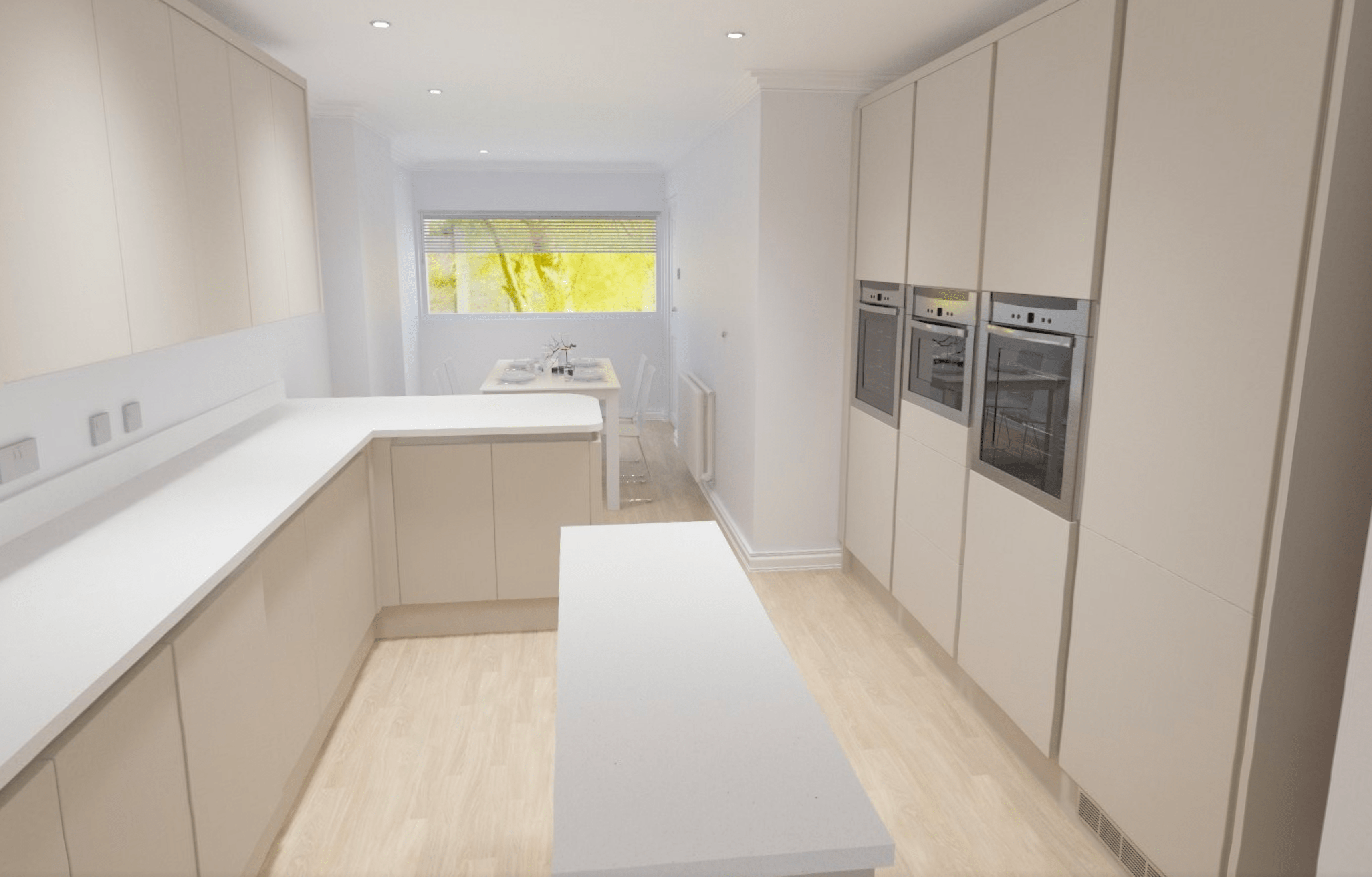
(Image: CAD visualisation of their kitchen design)
Well, even I am impressed with the outcome! The showroom I work in is so inspiring and full of incredible displays and design ideas, but it’s not until you see the product in a real home that you fully understand how amazing it is!
The brief for this kitchen was to create a modern space. My client wanted their dream kitchen to be streamlined, clear, uniformed and sleek, yet also warm and welcoming. My client loves to bake and wanted an area in the kitchen where they can prepare the dough, with easy access to the ovens. My client has a lot of members in their family and they wanted an area where they could entertain but also somewhere they could sit with their grandchildren when they come to visit. Both aesthetics and functionality was important to them, and they needed plenty of surface area and storage space. Their kitchen before was in need of an update and did not have as much storage or worktop space that they required.

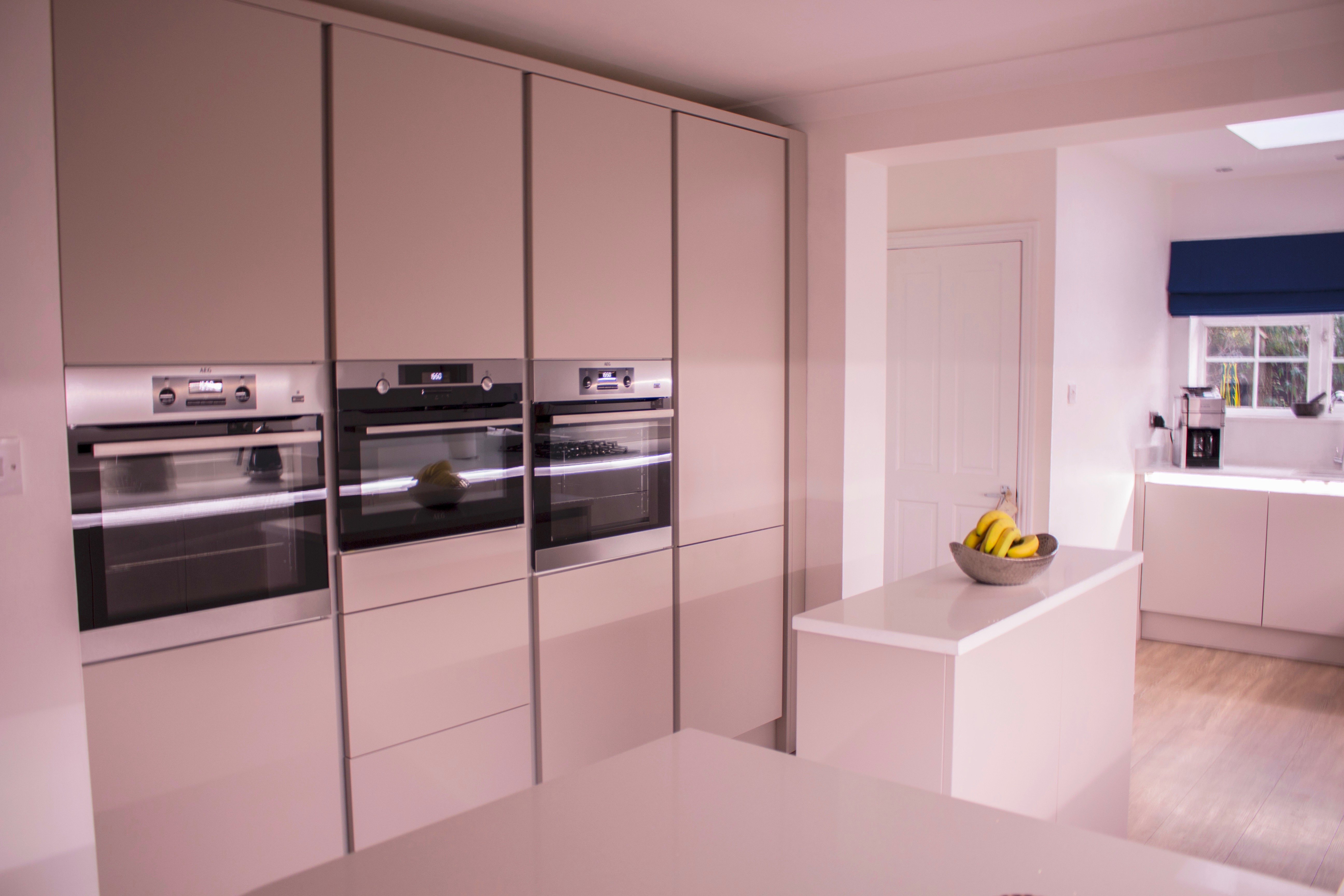

(The complete installed kitchen reveal! My own images.)
The space they had to use was quite large. The seating area was originally the garage, which they ended up converting to be part of their kitchen space, giving them more room in the home to have guests over for dinners.
When designing their kitchen with them, my clients felt that a handless style would give them the sleek contemporary look they wanted to achieve. After going through the different handless options Wren has to offer, we came to a conclusion that the Milano style in the Infinity Plus range was the right option for them. This style of handless doors is better for them for functionality and accessibility because of the profile that runs along the top of the door frontals and vertically down the tower units, giving their fingers a comfortable grip when opening the doors and drawers. The carcasses for this style of kitchen are made by Wren and the profile cuts in to the carcass, meaning that the doors are squared and it also means that the cabinets are truly handless.
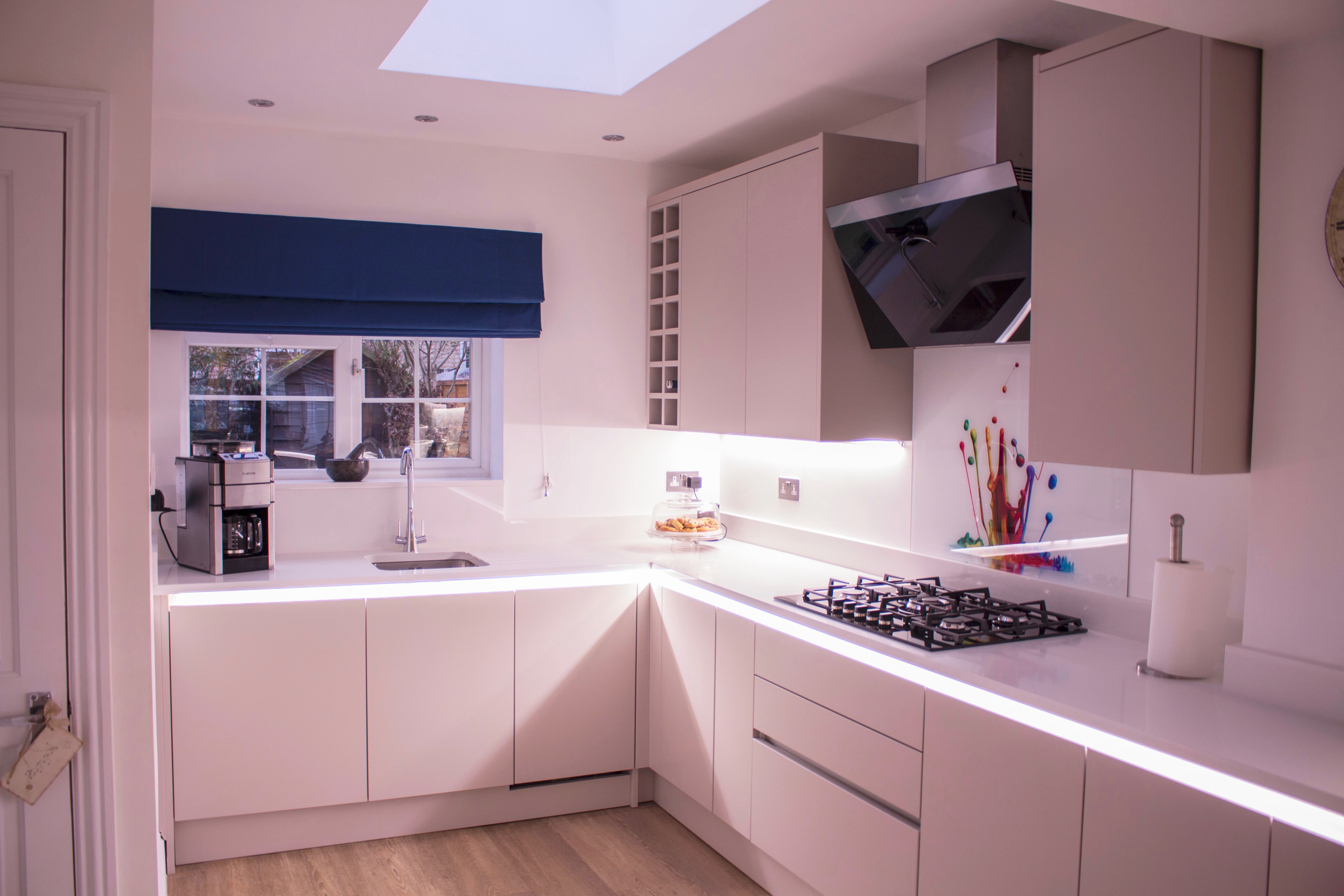

(One end of the kitchen. My own image.)
This also meant that we could create a great atmospheric vibe with LED lighting along the profile under the worktop and match that lighting underneath their wall units. These LED strip lights are not only fantastic for energy rating, but they also really pull this look together. My clients loved this as when it’s late at night, they don’t need to turn all the lights on to see where they need to go. They did joke that they’ve had comments from their family and friends that the lights make their kitchen look like “Starship Enterprise”. Something that I’ll take as a compliment as I love Star Trek, so the geek in me was giving herself a high five!

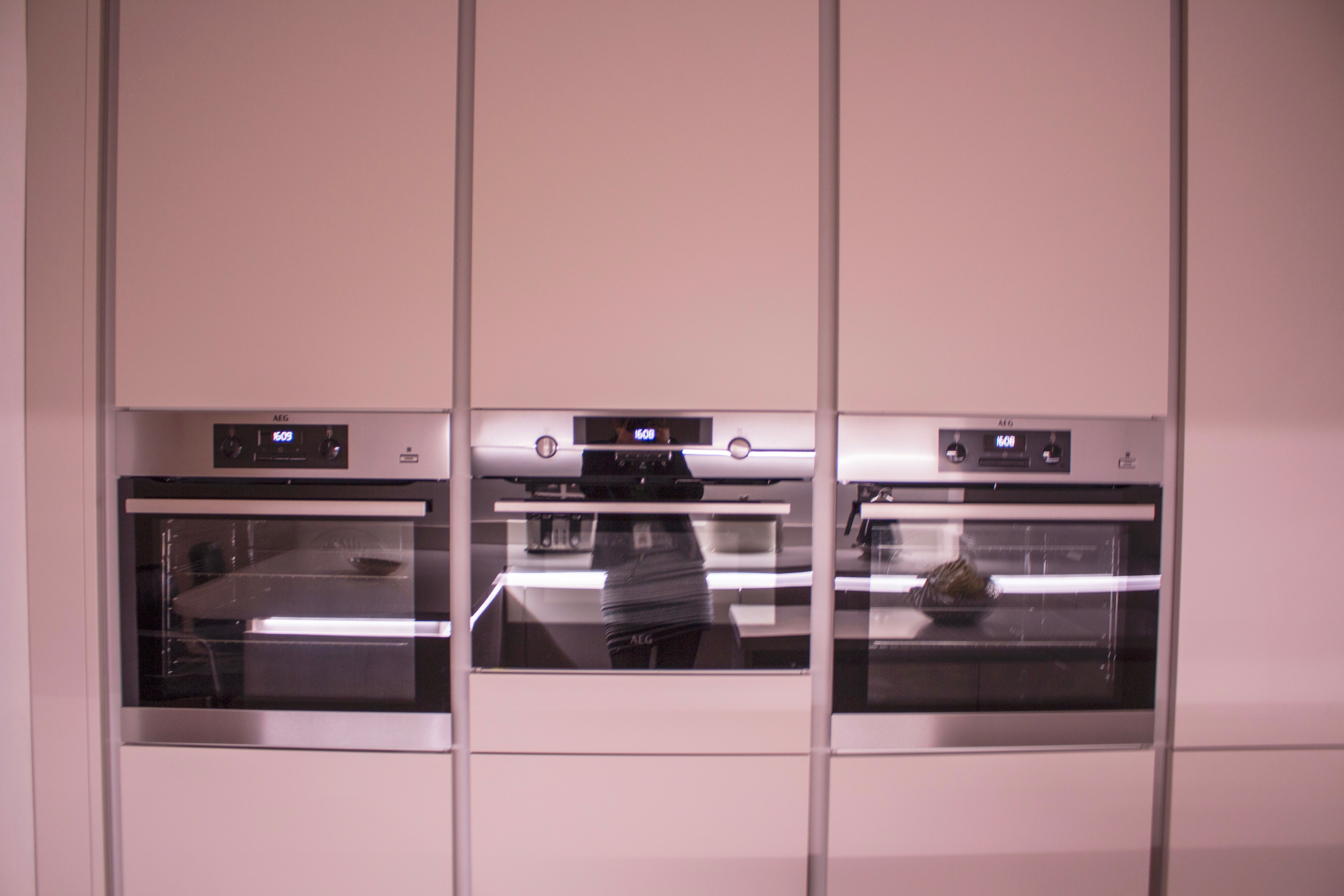
(Bank of tower units! My own images.)
How incredible does this bank of tower units look!? Originally there was a door along this wall that goes in to the living room, however my clients wanted to utilise the space to fit in the ovens, microwave and fridge freezer. We felt that it would be best to have their cooking appliances at eye-level, with the single ovens being placed on either side of the oven to achieve symmetry. Then we finished off the row of towers with a 70/30 integrated fridge freezer. This helps carry the eye around the room, as all the lines match up under the appliances and the lines are at the same height as the worktop.
(Cooking area. My own image.)
At the top end of the kitchen is where majority of their utility services are, which is where the majority of activity would be happening in the space. There was a lot that had to be fitted in to that part of the kitchen, which includes the sink, a dishwasher, their washing machine, a gas hob, extractor, as well as storage space and a drawer stack for their cutlery. This also needed to be within the rule son the working triangle, to ensure that my customers didn’t have to walk very far to get what they needed in order to complete any tasks they are doing in the space. The glass splash back is their own addition and they sourced it from Fleet Glass. I love it and think it adds in just the right amount of colour to the space and really lets their personality shine through!

(Island units. My own image.)
This is where the island units come in. You may be thinking it’s a tiny island, however in my customer’s old kitchen, they had an island just like this, at the same depth and width. The island is there to serve as a place for my customer to do their baking, where they can then turn around and place things straight in to the oven. When I visited them, they said they don’t use the island surface area for baking now, and actually use that as a place to serve up their meals or when they have visitors they set food out. They said that they now use the peninsular island as their prep area for any baking activity!
I’m so pleased with how this design turned out and I was really proud of it! My customers were really pleased with the end result as well!
What do you think? Would you go for a modern kitchen design? Or would you go more traditional like a shaker or country style? Let me know in the comments below!
Danica x

Leave a comment