Ok.. So I’m a bit late with writing about Pantone’s colour trend prediction for 2016… But, better late than never, right?

This is the first time ever that Pantone have chosen two colours to represent this years colour fashion trend, and it’s not hard to see why. Personally I love pastel colours. They’re playful and inviting, you can apply them in to anything without being offensive. Also, I have pastel purple hair and I’m obsessed with mermaids and unicorns, so my opinion may be biased.
Pale pastel colours invoke calm and relaxation. They help soothe you and your brain after a stressful day in the office and help you get to sleep more easily. This is something I learnt from my Childcare days as a Nursery Nurse, where I took part in a “baby room project’ course and learnt about what colours affect babies and how they affect them, how it can change their mood or brain activity. This doesn’t just work for babies, it works for adults, too.
We work hard every day, stressing over assignments that need completing, what we’re going to make for dinner, how we’re going to pay our bills or afford any essentials. There’s always something horrible going on in the world. It all has a negative effect on us, our mood and our health. These two colours can be used in any interior space to promote safety and tranquility, a paradise away from all of our stress and problems. Another reason why these two colours are predicted to be so popular is due to everyone becoming more accepting of the Transgender community and because of the still on going struggle for equality amongst all genders.

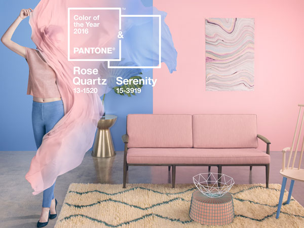
This combination reminds me of the Rococo/Georgian Era, where they used pastel colours in their interiors to show off how wealthy they were, often accessorised with gold gilt and white marble everywhere! You can use these two colours together in any interior space to create safety and tranquility!


Paint your chairs and accessorise with pastel pink and blue to add tranquility to the kitchen, which is possibly the busiest room in a home.


Decorate with both colours with natural textures and grey to spruce up a neutral colour scheme of your living room or decorate mostly with one colours and accessorise with the other, promoting a calming atmosphere where you can come home and relax after a long day at work or school.


Another trick to bring in more light is to accessorise with metals, and don’t just stop with one, try mixing and matching. I love mixing metals! It creates a great contrast between them and the Rose Quartz Pink and Serenity Blue! Also don’t feel you have to go with the exact same colours, you can tone them down or brighten them to suit your personal taste.


These colours would work well in a bedroom, too! Don’t be afraid to decorate with more than one shade or hue of a colour. You can use 3 different blue tones and one pink, or the other way around. Using a slightly darker blue can also inject some more masculinity in to the design. Darker flooring or furniture can break up the pastels nicely without over powering them.


Mix in other colours to create a more colourful and quirky interior, or to make it more l lively! Adding green and gold or apply smaller splashes of colour around the room to break up the two colours some more. I love the idea of painting the ceiling in one and the wall in another, and then just adding small details to tie them in to the interior together.
You can read the article on why Pantone have chosen these colours here, where you will also find the complimentary colours they have chosen to go with their Colours of 2016!
I hope this post has inspired you to try out pastel colours in your homes or even clothes!
Danica x
Note: None of the above images are my own.

Leave a comment